Rocks, Boats and the Zorn Palette
Somehow, I completely forgot to write my blogpost last week and this week I am running late. Its just been that kind of a time
I’ve been playing with boat shapes and more rocks and a zorn palette.
And everything has become more realistic and I am not sure why. I have lost myself back in the world of technically correct and less in the reaction to things happening on the panel in front of me. A bit exasperating when what I want is emotion rather than cold blooded reasoning.
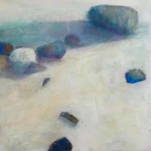
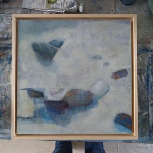
I like the rocks because it is just a play on composition and seeing how shapes sit together or not. It feels constructed though, carefully thinking about shapes – though these did materialize from shapes that appeared in the layers, and then were ordered by their value to create the composition. You can have as many objects as you want as long as those that are of the highest value difference are less and those that are close to the background value are more, so what stands out is minimal.
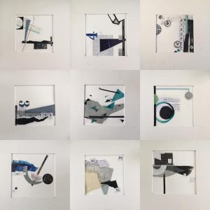
On with the collages and reached another finished nine, making 45 this week. More than half way to my goal.
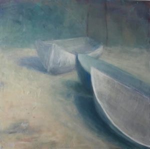
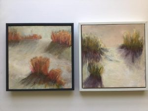
Then there have been boats. I really wanted to push the shapes to be more abstract but that didn’t work and I ended up with realistic boats in this misty blue landscape. I do love beached boats – the way they list to one side, their structure visible, though I did stop short of all details. I fell in love with the back boat in particular and its ghostliness.
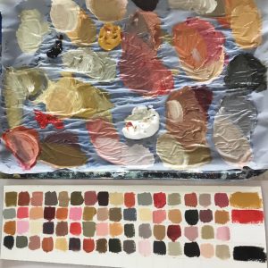
The Zorn palette reared its head again this week – Cadmium Red Deep, Yellow Ochre, black and white. Determined to find a way to work through this palette with some sort of reason rather than last year’s ridiculous attempts, I mixed colours just to see what you can get with these four. Yellow ochre and black with white make a great selection of sludgy greens. I think my black is too red in value and so I just couldn’t get the blues I wanted. Lovely pastel colours available too and the chromatic greys are sublime. I do find though that this palette is way too opaque for me. I prefer translucent colours. It would be interesting to try with different variations of the red and ochre – maybe a quinacridone red or alizarin and something like a quinacridone gold or lemon yellow. Thought for the future.
I came across you on Instagram and have looked through your posts from the beginning. It is really lovely to see your work evolve – especially over the last year. Your website is also clear, and interesting, and I really like the recent work – the spaciousness and simplicity. Well done you – lots of work but it is definitely paying off. I don’t need an answer to this – just wanted to give you a thumbs up – and say keep going!
Beverley, thank you so much for your response to my work. I am so sorry that the blog has lost so many images – its been moved several times and every time I lose something along the way. I hope to have you with me on my continuing journey. Support is so much appreciated in what is a very solitary pursuit! Thank you again!