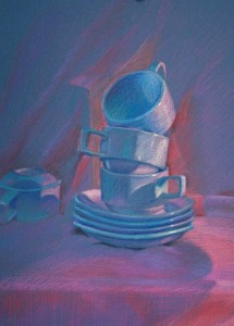
Tea Tower

Interesting time this week trying to organise lighting. It seems to be the biggest test I find each time I set out to do some artwork. Artificial lighting drives me crazy – its either too blue, or too yellow and I end up sticking bits of translucent coloured plastic up between the light and the set-up to try and get something that remotely appeals to me. So I’ve decided to buy coloured bulbs, coloured cellophane and some good lamps in an attempt to cut down on wasted time sorting out lighting.
I had fun doing this drawing – the colours were wonderful reflecting off the pink fabric. I was amazed by how it went from cool blue pinks in the light to quite strong reds in the shadows. Finding the contrasting blues and greens on the cup shadows was an added bonus.